Friday, March 30, 2012

Currier Museum of Art

The Currier has an exhibit right now called A New Vision: Modernist photography. i really enjoyed looking at the various types of photographs throughout this exhibit. I think there was a very wide range of photographers that had very different styles. It was very overwhelming choosing which photographs to focus on. I liked so many of them! I enjoyed looking at the abstract photography and it gave me inspiration and new ideas in continuing shooting in an abstract way. I thought the exhibit was organized nicely and gave a nice transition to each photograph. I liked how the images were displayed and the set up. I would recommend seeing this exhibit!

The two images that I chose to compare and contrast were Brett Weston-untitled nude (1979) and Carl A. Hyatt- untitled nude. Hyatt's photograph of the nude figure is much more abstract than Westons. The form and position the body is in creates a beautiful shape. I love this image. It reminded me of my emulation project. The foot and hand are in awkward positions which make the form and the body look abstract. I love the contrast between the tone of the body and the background. I like that the background is dark because it makes the form of the body stand out more. Westons photograph of the body is less abstract. It is more about the facial expression and personality on the women's face. Her facial expression and hand placement makes it look more intimate. It is less about the form and figure and more about personality. It also bothers me that the other hand is cut off, I would like to see more of it, because the photograph is already showing so much. The tone in the skin is darker than Hyatt's image. I liked Hyatt's contrast between the background and figure better. I really enjoy the curves and lines the figure creates in both images. They both give justice to the figure and have a lot of beauty to them. I love the curve that the hip makes in both images, it is absolutely beautiful! i think the print quality is good in both images. I think the composition in Hyatt's image works better than Westons because I like the abstract figure rather than showing too much. 

Brett Weston- Untitled Nude

Carl A Hyatt- Untitled Nude


The image that I thought was the weakest and did not fit in with the rest of the exhibit would be B.A. Kings photograph: lobster traps. I can't find this image online probably because it is nothing special! The color, print quality, and composition was horrible! It did not fit with the rest of the exhibit. But other than not fitting in, I don't like the image alone either. It looked really grainy when you look closely and the image does not look like it is printed well. I also don't like the bright yellow, I think the image is very busy and it would work better in black and white. I also don't like the composition because it doesn't look well thought out. It should have been closer up and more abstract. I think it would have been more interesting closer up and focusing on more detail, rather than the repeated ugly lobster traps!


Choosing one image to hang on my wall, is a very hard decision! I liked a lot of the images! One image that really stood out to me, but I don't know where I would put it in my house because it would be really random is Arno Rafael Minkkien- Fosters Pond Millennium. Every time I walked by this image, I had to stop and look at it one more time! I loved everything about it. I thought it was really interesting compositionally and the subject matter! I love the shadows, they are beautiful. I think the image is beautiful and really nice to look at! After I saw this image, I had to look up more of his work and I love it! It is so abstract and interesting to look at. It has such a mystical feeling to it. The background is just as interesting to look at as the foreground is, and I think that is what makes a good photograph:)

Arno Rafael Minkkien- Fosters Pond Millennium


Thursday, March 22, 2012

editing work in classss~

Mike looking all weird
(i really stink at the clone stamp..my other one looked better but I didn't save it opps)


Taking away the red on katie's face


and this is where I wish I was on this beautiful dayyyyyy


Tuesday, March 20, 2012

Scavenger Hunt with portraiture

Five Self Portraits:


Blue Alcove:


Red Stairwell:


Silhoutte: Portrait

(these were my favorite!!)


White Hallway:


Sillouttes: Architecture


Find the bird and shoot it!


Birds Eye view:

(On Michael's blog) 

An environmental portrait:


Portrait in shaded area:


Portrait in Direct sunlight:


Unique photograph:
(not that unique but we ran out of time!)


Monday, March 19, 2012

Camera Lucida


AHHH...This book started off very hard to read. Barthes is extremely opinionated and obsessive with his reflection on photography in the first couple of chapters. I felt like it was wordy at times and it was hard to stay focused. He lost me in the beginning, some of the terms and theories he made didn't make sense to me. I didn't know how i was going to finish the whole book. His tone was overwhelming at times and i felt like his sentences were really dragged out.....so I took a break after the first 10 chapters...


As I continued to read, I started to understand his point of view more and the relationship between his mother and his view on photography. He definitely seemed to have a changing view on photography throughout the book. Sometimes I felt like he was putting down photographers and a little harsh but other times he gave justice and showed love for the medium....this kind of confused me to what his stance actually was. 

Although he was annoying at times and I didn't agree with some of the things he said, I found myself getting more and more interested as I kept reading. I found myself agreeing with some of his reflections and thoughts. His mourning of his mother brought out why he loves photography but it also made him very harsh on a lot of photographers.  I liked when he talked about the photograph, “Winter Garden”. I liked the way he explained in detail about how much it meant to him. This photograph was a movement through time for him. It was reality and clearly represented an image of his mother. He saw truth in the image. This is what drew him to photography. He says, “It would tell me what constituted that thread which drew me toward photography” (Page 73)
He also says on page 73, “I cannot reproduce the Winter Garden Photograph. It exists only for me. For you, it would be nothing but an indifferent picture…” This is one of his theories, that photographs don’t mean the same thing for everyone. I agree with this.  I also found it interesting that he only chose one “true” photograph that represented his view and reflections. Why not a series of images? Why not his mother over time? I think change and time is important in photography but Barthes thinks otherwise.

I also found his view on detail very interesting. When he looks at an image he looks past the big picture or the photographers purpose or “point” (Punctum) of the photograph. For example he shows an image of a little boy with a gun up to his head, but Barthes points out the child’s bad teeth, and unclean hands. This is an extreme example where he focuses on everything but the "main point" of the photograph.

I feel like Barthes thinks "the photographer" doesn’t do much. He thinks the portrait or photograph relies on the subject and when it is taken. I don’t agree with this. I think he is unaware of the work a photographer puts in. There is much creativity and time a photograph puts into their work. It does not just rely on the subject. Some photographers can make a really boring subject, interesting!


I thought his view on color and black and white photography was interesting. He thinks black and white photography is more truthful than color. He thinks adding color is like adding an unnecessary layer to the photograph. He wants to see the photographs “own rays” created by light. He says, “Color is a coating applied later on to the original truth of the black and white photograph”. (Page 81)


I thought it was interesting how he compared light to “a sort of umbilical cord”. He also says “that has been” was possible only because of the chemists. The discovery of silver halogens that were sensitive to light made it possible.

Another thing that I found interesting in chapter 34 was when he explains what “photograph” means in Latin. I like when he gives definitions and other ways to look at things. He says it means, “Image revealed, “extracted”, “mounted”, expressed” by the action of light.

Overall, I am glad I read this book. I learned many different perspectives and views through Barthes reflections. Although I didn't agree with everything, I was able to think more about why I love photography so much. I think photography can be different for everyone and the lens every photographer looks through is different so there will obviously be different views. But it is important to understand and listen to other views to help us grow as photographers!

Sunday, March 18, 2012

Tierney Gearon Film

This documentary was very interesting. In Tierney's body of work called "The Mother Project" she is being accused of exploiting her mother. Throughout the film, she is trying to show what it is to be a mother. She shows through her photographs that everything in life is not perfect and  people will make mistakes. When i look at her photographs I feel like they have a very natural and care free feeling to them. She is not trying to exploit her mother or do any harm. I truly think she is doing it because she is trying to show something important through her work. I think her work is more personal than people think, isn't that what matters the most. Why do we all do photography? Because its what we love and we photograph things that mean something to us. That is all she is doing.  Some of her images are a little uncomfortable to look at but I think there are many artists that take similar risks.  I think it hard to say what she is doing, as an artist, is wrong. I think her body of work is very personal and it is important for her to do. People looking at her work might feel uncomfortable or not agree with what she is photographing but that is what photography is all about. If photographers didn't take risks and played it safe, photography would be boring. I think some of her photographs are beautiful and some can be more controversial. 


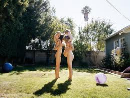
Another artist that work is viewed as controversial is Irina Ionesco. She took photographs of her daughter and she received the same scrutiny that Tierneys work received. Her daughter was only five when she began photographing her in sexual poses. Eva(the daughter) ended up suing her mother three times for emotional distress. The public saw her work as lacking morality and artless. The public turned against her work and did not agree with what she was photographing. I think Irina was trying to produce a shock factor and show a little girl as a women. I don't think she was trying to exploit her daughter. 


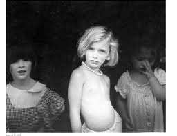
Another artist that has been viewed negatively at times is Sally Mann. Sally Mann also photographer her children nude. She stirred up controversy also and was seen as exploiting her children and child pornography. She was also looked down upon as a mother by the public. Her work was similar to these other two photographers in the sense of the shock factor. I don't think she was trying to cause any harm. She was trying to show something through her photography like any other photographer trys to do. She wanted to show the natural and "true" process of children growing up. The truth is sometimes life can be uncomfortable and things might be hard to look at her grasp but its life. And all she was trying to do was show this shock factor through her series called the "immediate family" . I think her photographs show reality and what it is like through a maternal view. 


Here are some examples:


                                                                     Tierney Gearon


Irina Ionesco


Sally Mann


Soft box light

I am emulating John Coplan so I used the soft box light over break to get a similar effect he does with his images!  I loved the effect the lighting gave! I am really excited to start editing and working with all of my images! Here is two of my favorites, I haven't looked through all of them, but these two stood out to me:)


Lighting Demo in class!

Here are some shots I took in class! I liked experimenting with all of the different lights!


Tuesday, March 6, 2012

Homework assignment: Lighting

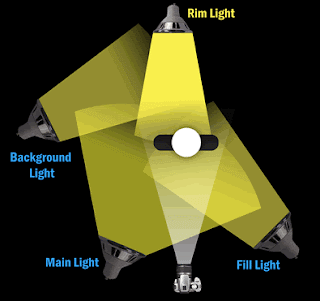
Rim Lighting: This is a technique that is used to give shape to objects in an image by backlighting the subject. When used as an effect, it gives the subject a lighted halo around them and a delicate look. It is most often used to define shapes against a background, but it can also be used to highlight subtle effects of a photograph. The light comes from above the subject and it must be directed toward the camera. For a more diffused effect, you can use a reflective surface to direct the light.

Here is the set-up :

Here are some images that used Rim Lighting:


Low Key Lighting: is a style of photography that utilizes mostly dark tones to create a dramatic looking image. The background and subject matter is dark. It intensifies the contrast in an image through intensely reduced lighting. It adds a very dramatic mood to the images. This effect produces harsh shadows.

Here is the set-up: 


Here are some images that used low key lighting:


(I found these images on google search images: low key lighting and rim lighting)